Flickermood 2.0: typefaces, music and motion graphic
Flickermood 2.0 from Sebastian Lange on Vimeo.
The next level of this experimental typographic orgy.
Animation by Sebastian Lange
Music by Forss
Flickermood was basically all done in AE/FCS - the soundtrack
is from FORSS (check out his music platform at http://www.soundcloud.com and his music at http://www.forss.to).
Originally
from
ReBlogged by Michela on Mar 13, 2009 at 02:35 PM
| Comments (0)

emoticon in 1862

A typo was found in Abraham Lincoln's speech and a debate ensued: were emotions used in 1862? ;)
“… there is no precedent for your being here yourselves, (applause and laughter ;) and I offer, in justification of myself and you, that I have found nothing in the Constitution against.”
(via nytimes.com)
Originally
from
ReBlogged by jacqueline on Feb 2, 2009 at 11:59 AM
| Comments (0)
The sexy old type
Good news! You can download the font GEronto Bis for free (read the license), and take a look at the PDF specimen. Nice ligatures and ornaments.

Originally
from
ReBlogged by karol de rueda on Aug 27, 2008 at 03:25 AM
| Comments (0)
Vernacular Typography Polaroids
Sweet series of hand-painted signs and vernacular typography polaroids taken over the past six years by Douglas Wilson.

Originally
from
ReBlogged by karol de rueda on Aug 1, 2008 at 12:13 AM
| Comments (0)
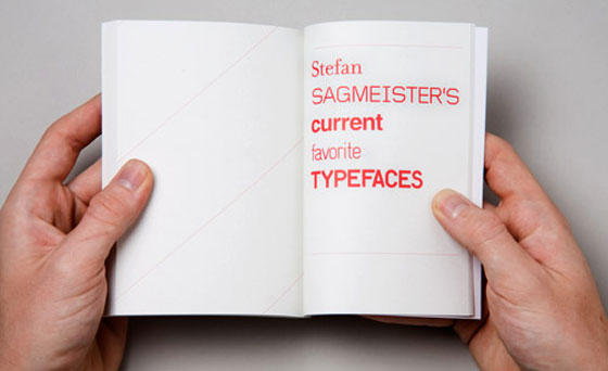
Typefaces for a good cause
Create/Reject is based in the UK and specializes in design, typography and art direction. It is also responsible for the book Fifty Designer’s Current Favourite Typefaces, which is not just a pretty nice idea, but also a very kind project since 100% of the price goes to UNICEF.
Originally
from
ReBlogged by karol de rueda on Jul 15, 2008 at 11:37 PM
| Comments (0)
Fashionable type
Sweet typographical scarf by Little Factory. They also have a lowercase and a numeric version.

Originally
from
ReBlogged by karol de rueda on Jun 30, 2008 at 07:37 PM
| Comments (0)
Rotalic
You know Italic, you’ve heard of Roman and you know what Rotation is.
Let us introduce you to Rotalic.

This typeface variation by Filip Tydén (2007) is mainly used to highlight a text or as a display font. As wikipedia says, it can fit the same semantic purposes of the italic and oblique typefaces (emphasis, titles, foreign words), though examples of its usage are still rare.
Originally
from
ReBlogged by karol de rueda on Jun 27, 2008 at 04:19 AM
| Comments (0)
Good Web Type
This is a very hard one: what is good web typography? Your work can be amazing and your layout perfect, but the wrong type can in fact kill your whole site.
To save our sanity, I Love Typography shares with us in a very functional and clear way 15 Great Examples of Web Typography. Nice!
Originally
from
ReBlogged by karol de rueda on May 21, 2008 at 03:18 AM
| Comments (0)
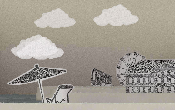
Type City
A tour around Type City will show you, in a very pleasant and beautiful way, many typefaces and their use. Nice sounds too.
Originally
from
ReBlogged by karol de rueda on Apr 24, 2008 at 05:09 PM
| Comments (0)